Dark Mode 2.0: Does It Actually Improve UX or Just Trendy!!
In recent years, dark mode has emerged as a dominant trend across mobile and web applications. At its core, dark mode is a user interface (UI) setting that displays light-colored text, icons, and elements on a dark background. Advocates cite benefits like reduced eye strain, improved battery life, and a modern aesthetic. However, while dark mode may enhance the experience in some contexts, it can also introduce usability challenges, especially in applications that require high attention to detail or readability, potentially leading to user errors or friction.
The question arises: do usability improvements truly drive the advancements and persistence of Dark Mode, or is it more about aesthetics and following the trend?
Trend vs. Function: Finding the Balance
While dark mode is often associated with modern, sleek aesthetics, it’s important to ask: Is it always the right choice for usability?
In many cases, it’s adopted to follow trends rather than improve user experience. For example, banking apps require maximum readability and precision — poorly implemented dark themes can hinder focus and lead to costly errors.
On the other hand, media and entertainment apps, often used in low-light environments, benefit from dark mode. But for data-heavy tasks during the day, light mode generally provides better legibility and reduces cognitive load.
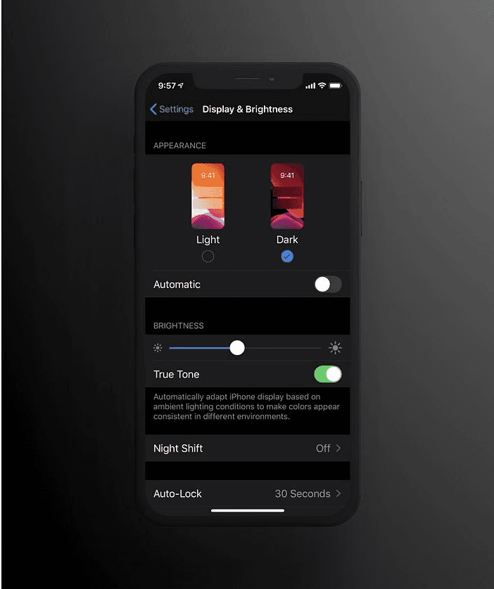
The best UX approach? Offer user choice. Supporting Light, Dark, and System Default modes respects accessibility needs and user preferences, rather than forcing a one-size-fits-all solution.
Digging Deeper: The Evidence vs. The Hype
Let’s explore the potential pros and cons of dark mode to better understand its functional impact and offer some thoughtful insights to challenge our design assumptions.
Eye Strain & Readability:
Pro: Can reduce strain in low-light conditions by minimizing glare. 6 hr is the average time spent by a working individual on screen.
Con: Light mode often offers better readability for long text passages, especially in bright light. Light mode is also better for reading and doing data-heavy tasks, as the text is more easily visible due to high contrast, reducing eye strain.
Battery Life:
Pro: Dark mode primarily benefits devices with OLED or AMOLED displays, which are common in newer devices. On these displays, dark mode turns off pixels when displaying black, saving power.
Con: Dark mode on devices with older LCD screens, which use a backlight, provides minimal or no battery-saving benefit.
Accessibility:
Pro: Individuals with conditions like cataracts or photophobia may find dark mode more comfortable due to the decreased brightness and glare.
Con: Crucial point: Requires sufficient contrast. Poorly implemented dark mode (e.g., low-contrast text, certain colors) fails WCAG(Web Content Accessibility Guidelines) accessibility guidelines and can be worse than light mode contrast.
Defining “Dark Mode 2.0”: Beyond Simple Inversion
This is where we define what we mean by “2.0” based on best practices:
Not Pure Black: Using dark grays (like Material Design’s #121212) instead of #000000 for the main background reduces harshness and helps convey elevation.
Desaturated Colors: Highly saturated colors on dark backgrounds can cause visual vibration and strain. Using muted tones improves readability.
Thoughtful Contrast & Elevation: Use varying shades of dark (not just pure black) to create a clear visual hierarchy and depth. Ensure all text and UI elements meet WCAG contrast ratios for readability and accessibility.
Semantic & Adaptive Design: Leverage platform-native colors and system assets (e.g., Apple’s HIG, Material Design tokens) that automatically adapt to light/dark themes, ensuring consistency and better performance across devices.
User Choice: The most important “2.0” feature — offering Light, Dark, and System Default options.
These thoughtful implementations are what could truly improve UX, addressing the shortcomings of basic dark mode.
Best Practices for Implementing Dark Mode
Prioritize Accessibility: Follow WCAG contrast guidelines for text and elements.
Avoid Pure Black: Use layered dark grays for comfort and visual elevation.
Desaturate Accent Colors: Reduce eye strain and prevent visual vibration.
Test Across Environments: Evaluate legibility in bright light, low light, and across devices.
Always Offer User Choice: Light, Dark, and System Default should be available.
Conclusion: Shine a Light on Smart Design
Dark mode isn’t a universal UX upgrade — its benefits are nuanced and highly dependent on context: screen type, lighting environment, user preferences, and the quality of implementation all play a role. What works beautifully in a media app at night might hinder usability in a banking app during the day.
That’s why the real value lies in what we can call “Dark Mode 2.0” — an approach grounded in thoughtful, accessible, and user-centered design. It’s not about following trends, but about giving users functional, aesthetically sound choices.
In the end, great UX is not about choosing dark or light — it’s about illuminating the user’s path with clarity, flexibility, and intent.